Competitor Conclusion

We have established that we have competitors that cover almost everything coding-game related, but we have also established that these competitors could do certain things better, like layouts of some of their games for example.

We’re not trying to become a huge brand, we’re not trying to take anyone’s place; we are just simply trying to add a new, more educational game to the current market in the hopes that it can be of help to people trying to learn code.

Competitor Analysis: Tynker

Another competitor we will face is Tynker.

Tynker

Tynker is an American website with games to help children learn to code. The age range specified on the website starts at kindergarten and ends with grade 6+. Making it similar to the U.K’s primary school level. The website is also part of the ‘Hour of Code’ campaign.

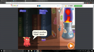
Similarly to Code.org, Tynker has a range of games from beginner to intermediate. The beginner games tend to focus on the drag ‘n’ drop technique, however the block of code that has to be dropped is simply just a word; for example ‘Walk’, whereas Code.org has the actual code written on a block.

Tynker Code


Unlike code.org Tynker is a profitable business, in which visitors to the site can purchase ‘plans’ for programming courses and a Minecraft server.

Tynker Plans

The Minecraft server is included because a fair amount of the programming is Minecraft based, such as mods, skins and textures. This is a great way for getting kids involved because children tend to enjoy Minecraft and by doing this, they are being directly involved with a game they like.

In terms of competition with this company, we would be able to produce a better version of their beginner games as a starting point because we want our users to learn, not just memorise blocks. We also want our users to understand the code itself and how and why it does what it does. Tynker doesn’t seem to do this (in it’s beginner games anyway).

– Ryan

Padlet

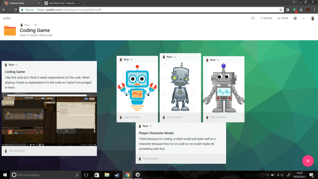
Today we have set up a Padlet so that we can collaboratively work on mood boards to develop our ideas.

Here we will add images of art styles, level designs, things we like from other games, colours, character designs and anything else we can find to generate an overall feel for our project.

Padlet


(Click image to view Padlet)

– Ryan

Competitor Analysis: Code.org

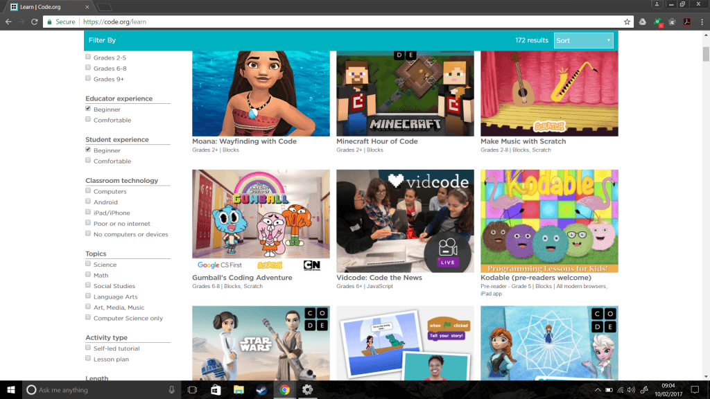
By typing ‘coding games for kids’ on Google we are greeted with an array of search results. One of which in particular is code.org. Code.org offer 172 results for games that teach/help kids of a wide spectrum of ages learn how to code.
code.org


The non-profit organisation is a huge competitor for our project because they have already engaged 10% of all students in the world, organise the annual Hour of Code campaign and has donors such as Microsoft, Facebook and Google (https://code.org/about).


Competing with such a huge and largely backed organisation would be like bringing a plastic spoon to a gunfight. It just isn’t going to happen and isn’t worth the effort.


However, what if we weren’t to compete, but instead add to the existing catalogue of games in their library with something slightly different, or something that engages the children in a different way?


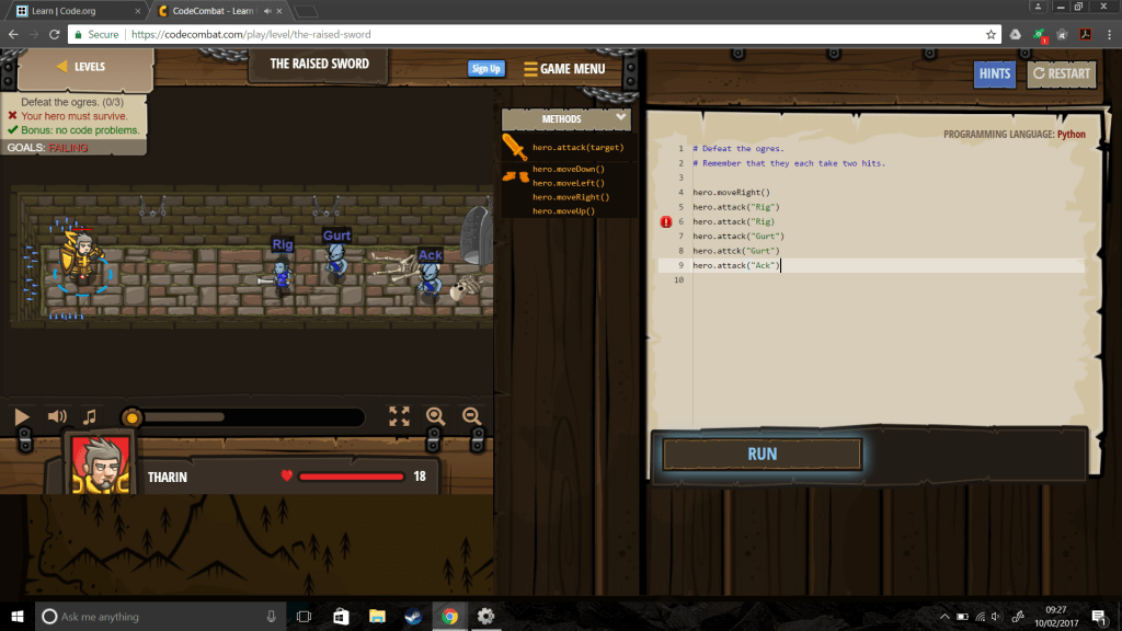
We have noticed from playing a handful of games on the website that the code isn’t really explained. On some games it’s a block of code in which the user drags and drops into position on the coding screen and in more advanced games the code is shown on screen but the user has to manually type the code in, in order to progress, like this…
Example Game


(Click the image above to play the game in a new window)

We would like to create a similar game to above, perhaps more puzzle based; and we want to include reasons for why the code is why it is, so that the user is able to remember better and go on to code their own games.


– Ryan
Sketches

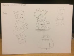
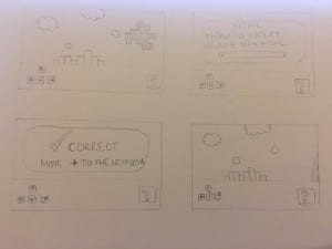
Character designs Level designsThese as you can see are very early sketches but these are just what myself and Ryan have worked on thus far. Ryan worked on the character designs which we wanted to go for a simple approach and a easily recognisable character that the player and see and know who he is. Once final character design has been finished we will even give him a name which will allow the audience to relate to the character more so and hes more human with a name, on the other hand we also like the idea of the player inserting their name as the character to give it a more personal feel to the game whilst playing the game as the character goes through the game so does the player and it gives it a much more personal feel if it feels like their in the game as well as playing it. As far as character level designs we want to go for the same sort of style for each level but different so that the children playing don’t get bored when they are playing the game, we want them to keep playing and keep learning!

-Dylan