R.A.M Pickup Item: Initial Design

This morning I have been working on designing the in-game pick up… The R.A.M.

I searched on Google for R.A.M to get an idea of how I wanted it to look and I also looked at cartoon style drawings. I initially begun by designing a 3D-looking image before deciding that our game will be 2D so it would look out of place.

Here is my first complete design. I will be having a discussion with Dylan about how he feels, whether he likes it or can suggest any improvements before developing further if need be.

RAM Pickup

I am happy with how it looks and I’m confident that it will be clear to see and understand what it is while in-game and in the world we create. I think that even if the player has never seen a stick of R.A.M before they will easily be able to identify this as a computer component or something of the sort.

Personally after having looked at the design, I think it could potentially benefit from being thinner, and maybe longer. It looks a little tall and chunky, whereas R.A.M is typically fairly thin and long.

– Ryan

Competitor Analysis – Not A Hero

Not A Hero

This game is not a coding game, however, we really like the style of it. This is roughly how we want our game to look. Not necessarily in art-style, but certainly in level design.

I personally feel like for our research we need to look away from just coding games and although this game isn’t educational either it still has the same mechanics in which we intend to include in our game.

In essence we would like to make a game just like this, however, make it educational because we believe that if you can get people to play games like this for just a few hours a day but with educational factors included in the game then we will have created a successful, educational project that can do good in the world.

This style of game will allow us to add all the aspects of the type of game we want to make, for example, the pickups with the pieces of RAM and the player interaction. This style of platformer game will allow us to bring the coding education and the game together as at certain points in the game we can stop the character and have them answer a coding question before continuing.

Watch Ryan test play a level from the game. (In-game footage/audio only).

-Dylan

Competitor Analysis – Basketball Game

Basketball game

(Click image above to play game in a new tab)

This game is worth reviewing because it is styled very similarly style with other coding games.

Almost immediately after playing these types of games Ryan and I decided that we don’t want to do a game like this because the drag and drop system doesn’t allow the player to learn as well as if they were writing the code themselves. By dragging and dropping blocks of code, the user can simply remember the block shape and therefor not even need to read the code, let alone learn it.

The game is simple and easy to play which is perfect for its intended target audience. We like some aspects of the game such as the character customisation – where you can change the hand. We also like how easy it is to play the game; you can jump straight in without any information.

The style of game differs a lot from our first thoughts of what we envisioned our game to look like. The layout of this game is similar to what we’d like ours to look like. We like the split-screen technique with the use of the court one side and then the lines of code the other, however we plan on having a larger game screen to improve enjoyment. We will need to have a well sized code area though as it is a big element in our project and we cannot shy away from that. In order to give the code element of the game more emphasis whilst still having a game screen big enough to be played it might be worth styling the code area to be similar to the game or to link one way or another; as if it were actually in-game.

We don’t like the drag & drop blocks in the above example because we feel as though the player is less able to engage with the subject matter at hand, and therefore is less likely to learn as they can simply learn which blocks go where by shape alone.

– Dylan

Paper Game Plan

Firstly I thought that I would start by getting our ideas onto paper of how want the overall game to plan out. Here are the results:

Wireframe 1 Wireframe 2

We needed to get a plan for the how the game navigation will work so I added 4 options; one to go straight into the game, a how to play button, settings and a button which will be linked to the partnering website. On the how to play screen there will be a lot of information on how to play the actual game so like the buttons (w,a,s,d) and alongside them there will be screenshots from in game showing an example. I have added a settings option just in case we need it or not so that is not final as of yet as we me not even need it but it is certainly something to consider.

The next part I have broken down how the game is going to look, for example you can see where text is going to be, where the character is going to be and the obstacles etc.

-Dylan


Character Development

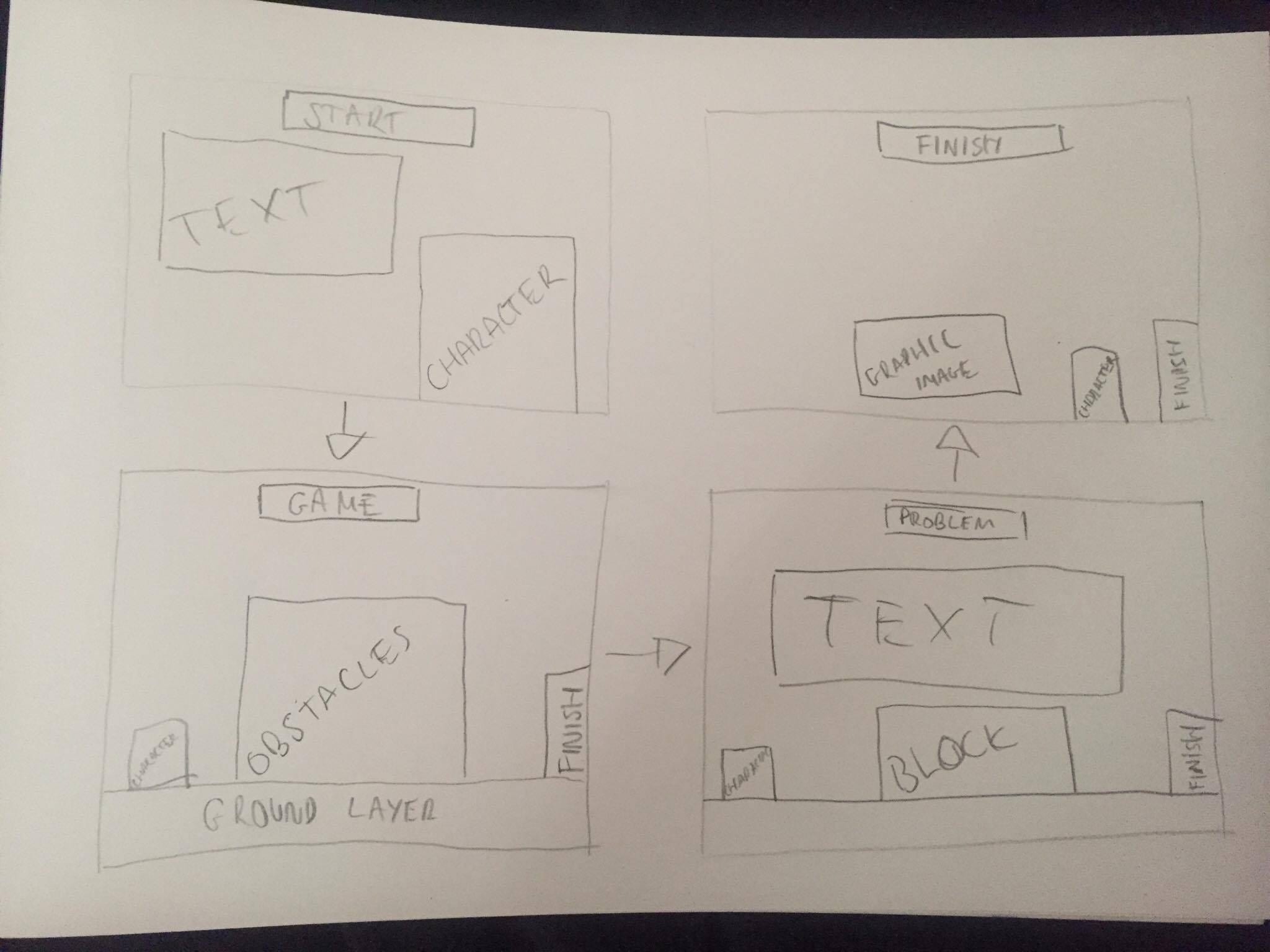
Today Dylan and I decided to theme the player character after a robot with the base idea that robots run off code. With that in mind here are the current designs (and developments).

Robot 1


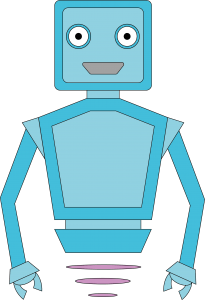
Here we have a basic, brightly coloured, friendly-looking robot. The colours are like this in order to appeal to a young demographic. We didn’t think however that the robot was good enough so we developed the idea further now that we had a starting point.

Robot 2

As you can see I have removed the black outline from all elements of the image so make it seem less harsh and in a way, more friendly. I changed the mouth colour from grey which I think makes the image look better. For more contrast I have changed the arm colour to a light grey so it compliments the other colours well. For the next change I want to focus on the head shape because I feel like it doesn’t do the character many favours or look overly appealing.

Robot 3


I like the new head shape but feel as though it is lacking definition and contrast with the other aspects of the face. Dylan suggested I add the secondary colour to the face to get that contrast back and I agree with him so for the next development I will do that.

I have changed the style of the body/torso of the character to resemble that of a screen with code on it (not accurate code, I know – but a symbolisation of code). Dylan and I are still discussing the role of this; whether we want it to be dynamic and change as the game is played to perhaps provide hints to the user, to remain the same and stay as it is, or to be changed completely.

Robot 4

I like the addition to the face and feel like Dylan’s suggestion has done the character a lot of favours. It certainly looks a lot better, more real and more friendly. I am unsure on where I stand with the whole floating aspect of the character. This may be developed to see what it looks like with legs, or developed to have variations of floating. I find though that by the character not having legs it is then easier for us to give it movement in the game because it would have less to do, and less could go wrong, whereas with legs we would have to create multiple ‘moves’ as it were which would be time consuming, and not necessary for the core of the game. This is something Dylan and I will discuss in the days to come.

– Ryan